Chang Hong / 長宏興業
Art direciton : Ching-Ming Chen
Visual Design : Ching-Ming Chen
Client : Yi-Ting Zhao
Printer : Design Print Pro Lo.,LTD
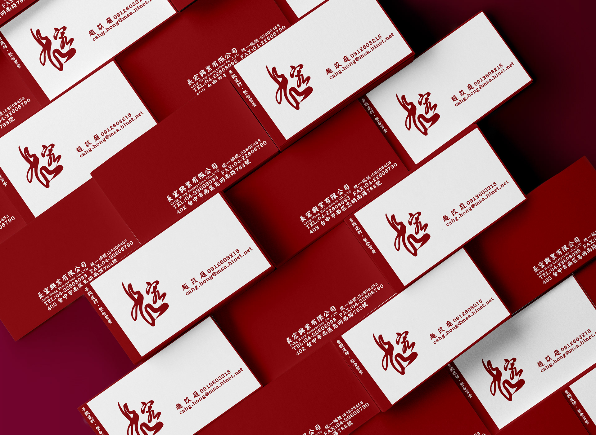
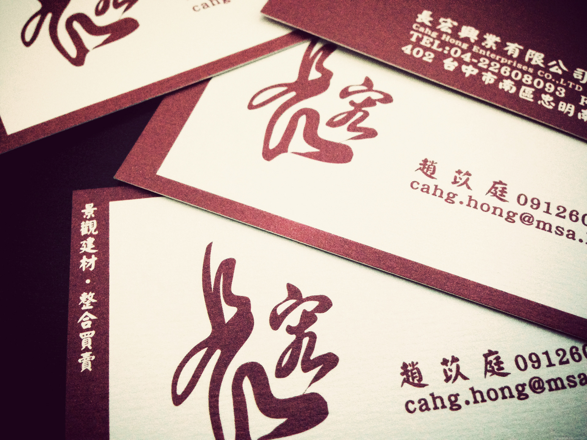
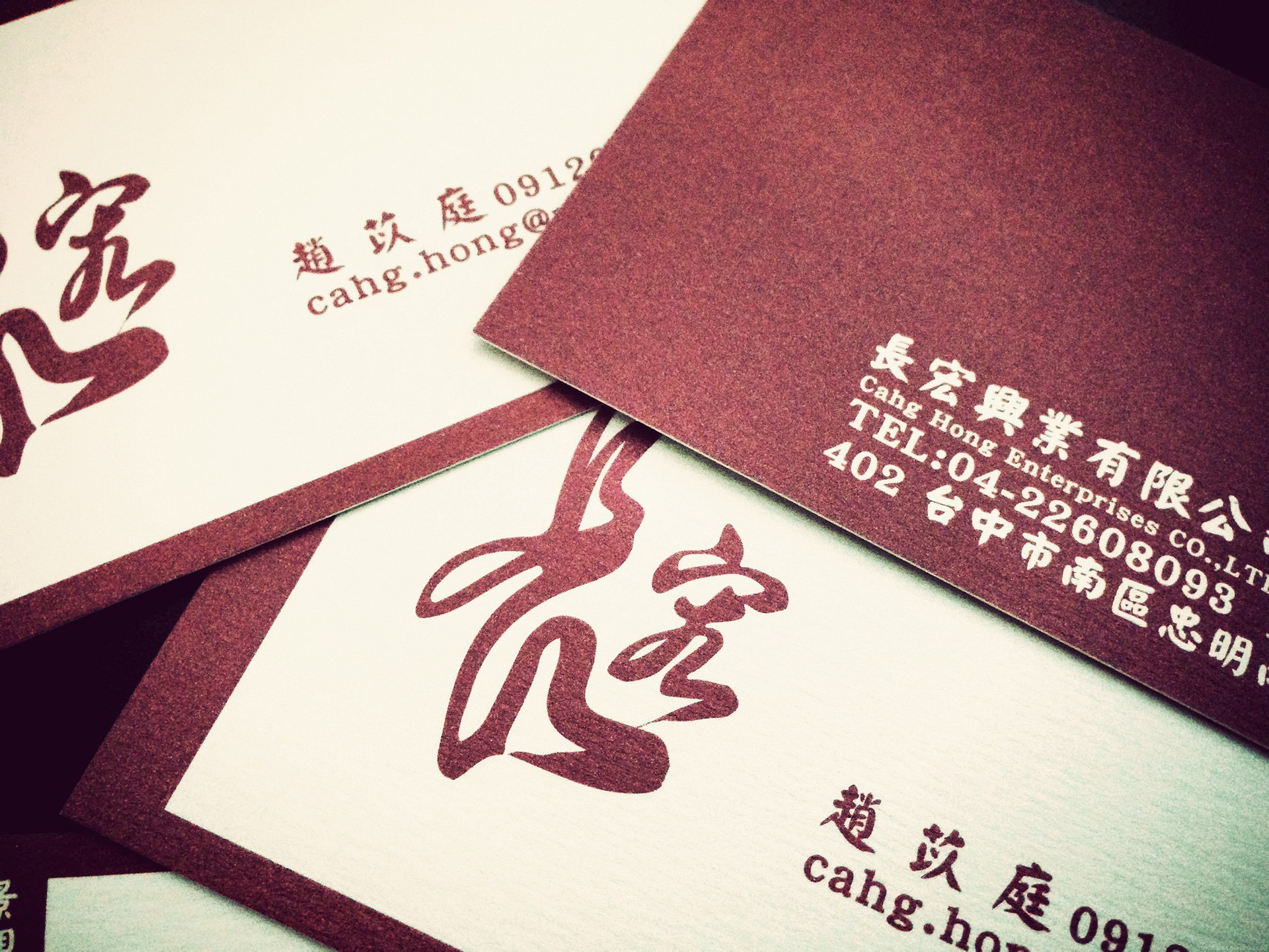
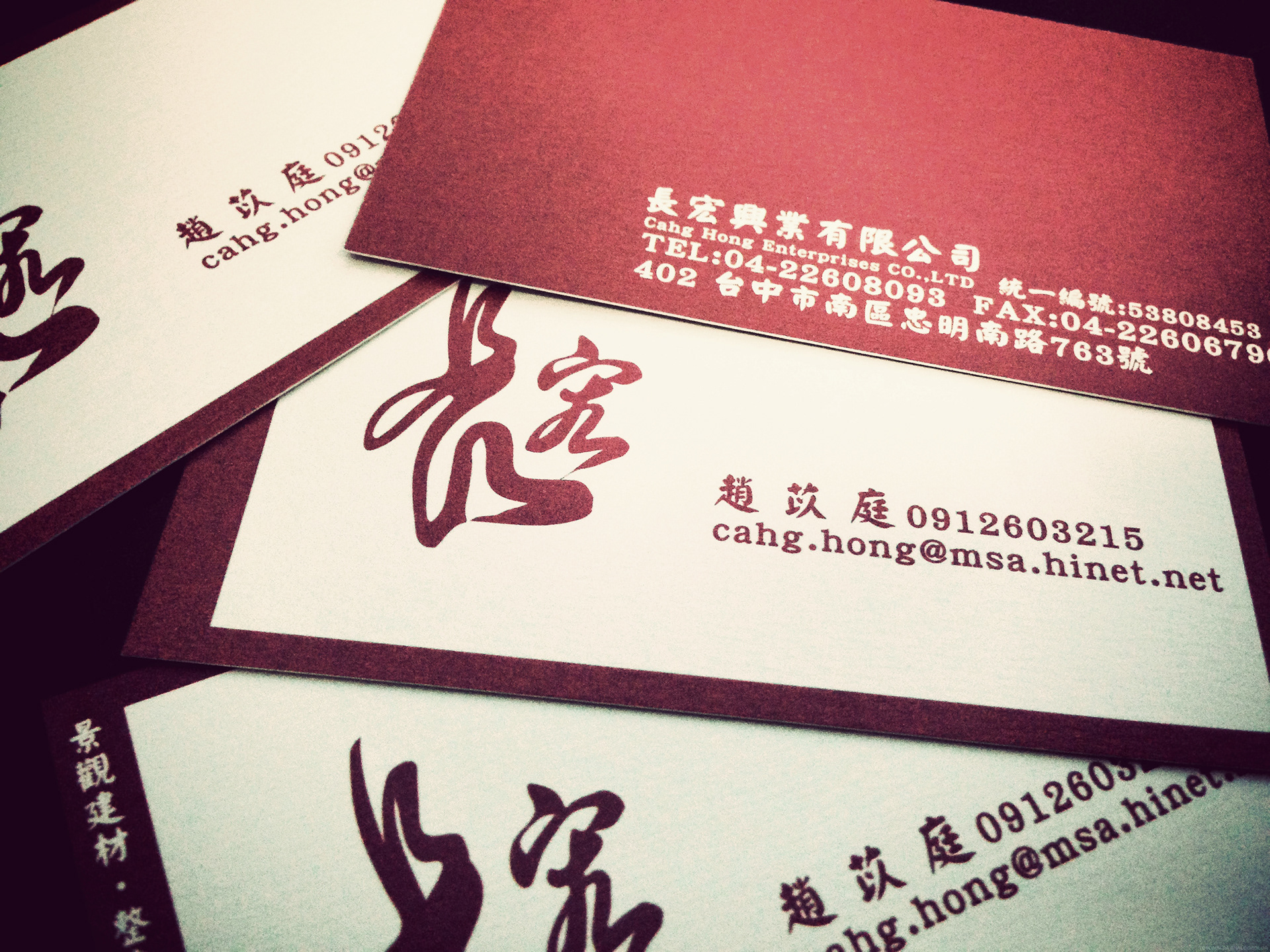
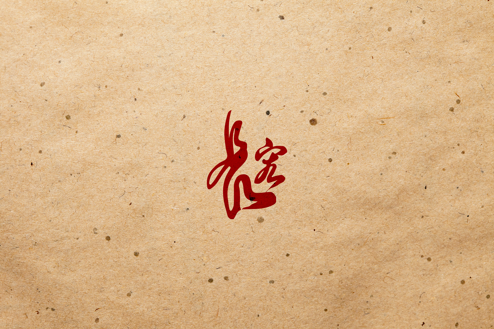
案主為景觀設計公司,在形象上希望能呈現出禪味。
故設計重點著重在中文字上,利用書法的行雲流水來呈現出禪味。
故設計重點著重在中文字上,利用書法的行雲流水來呈現出禪味。
字體選用傅山的行書為藍本加以設計。
而配色上則以硃砂紅為主色系;
硃砂在古時用於驅邪避邪用,在營造風水上更具有一定的作用。
The client is a landscape design company, in the image is expected to show zen.
Therefore, the design focuses on the Chinese characters, using the calligraphy flow to show zen.
The typeface is based on the calligraphy of fu shan.
The main color scheme is vermilion red.
Cinnabar is used in ancient times to drive away evil spirits and avoid evil spirits.
Therefore, the design focuses on the Chinese characters, using the calligraphy flow to show zen.
The typeface is based on the calligraphy of fu shan.
The main color scheme is vermilion red.
Cinnabar is used in ancient times to drive away evil spirits and avoid evil spirits.